.
Hello,
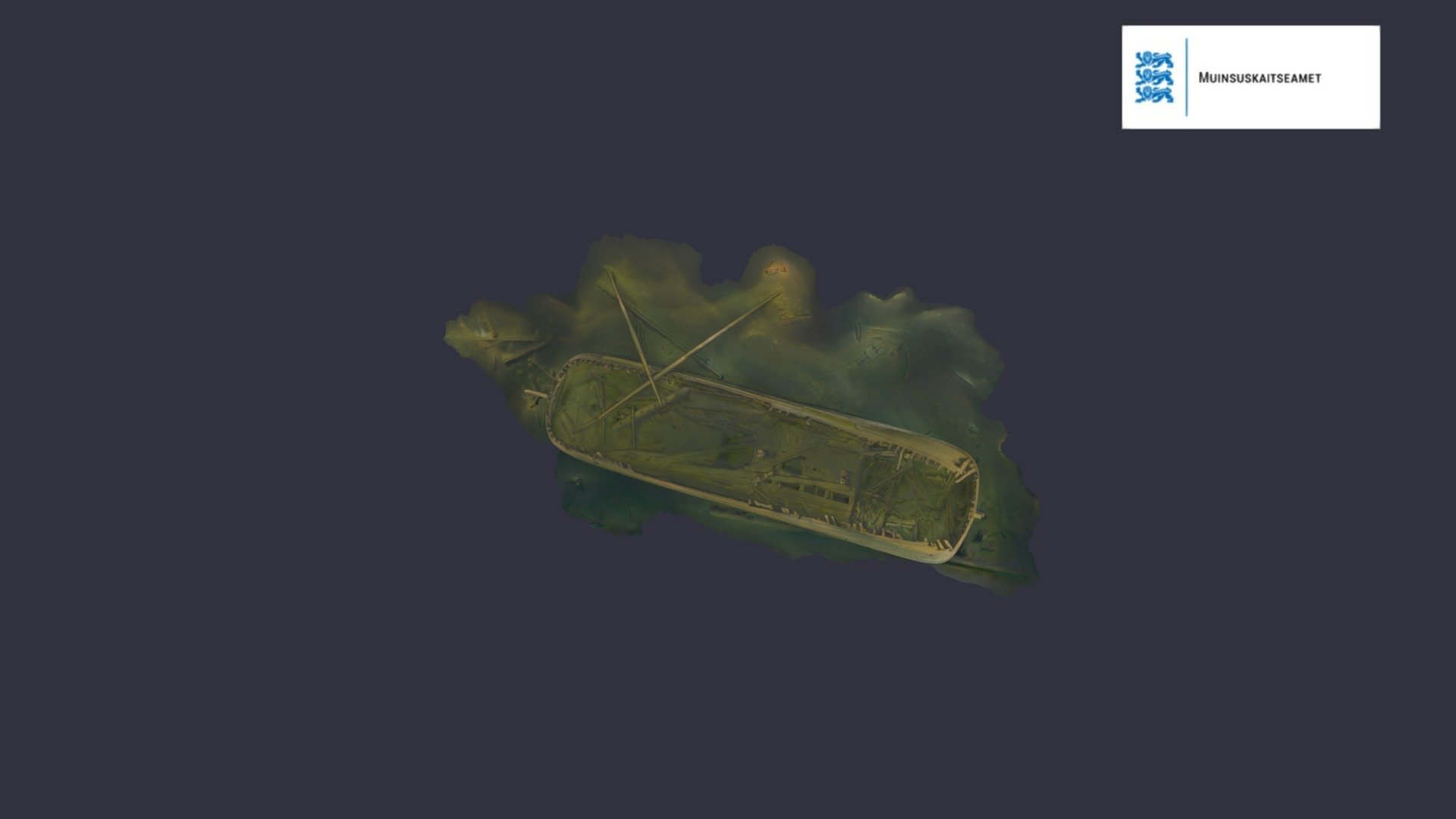
It is a very fortunate circumstance that both posts showed up at the same time, as the photos of the wreck shown by Martes are excellent material for comparison and for additional clarification.
The first point is that the lines as drawn on the (optionally made) plans were not necessarily the same as those achieved during the actual construction of the ship. This is more easily shown by the example of the line of greatest breadth (blue) or wales, which on the drawing are approximated on the sheer view by the arcs of a circle (because they are easier to draw), while in reality it would be the catenary line, obtained by hanging a rope between the cross-beams at both ends of the ship (because it is easier to obtain at actual scale). As it happens, with such large distances between the cross-beams, geometrically the two lines coincide almost perfectly.
* * *
Now more interesting, because it concerns the most important line in perhaps any design concept – the line of the floor (green). The wreck shown by Martes reveals quite clearly that the ship's circular stern is raised higher than stern of the Rålamb's fluit, presumably to achieve better waterflow to the rudder and for overall better weatherliness, a lack of it being generally a weakness of boxy hulls. Of course, this was done at the expense of the ship's cargo capacity. A matter of choice.
In design terms, this was achieved by raising the line of the floor in this part of the hull, as shown in the diagram. The specific geometrical shape is of little importance here, as such a formal shape is primarily needed for the formalistic drawing of this line on the paper plan (optional and generally unnecessary in such simple methods). This line could just as well has been arc of a circle, ellipse, logarithmic curve or desired combinations of these. It is sufficient that this line should be such that it reflects the design intent (that is, in practice, higher or lower in the appropriate places).
In addition to adopting a specific curvature of this line, this was of course also adjustable by the height of the cross-beams. And here, too, there is a simplification, as the distance between the last frame (here #2) and the sternpost is irrelevant, although this section of this line was usually drawn on formalist plans. By omitting this unnecessary section in shipbuilding practice, the cross-beams could have been set lower, but more importantly, the curvature of the hanging guide rails did not have to be so extreme at this particular spot. This is also shown in the diagrams below.
I have also shown on the diagram the different shapes of the last frame #2, resulting from a different run of the line of the floor at the stern part of the hull.
* * *
The same is true at the bow: a low position of the line of the floor translates into a full bow, more cargo capacity and less tendency to pitching, while a high position of this line translates into a sharper entry and better weatherliness. Again, the formal geometrical shape of this line is irrelevant, and Rålamb in his own description of the fluit only notes its typically low position for freighters, and not its specific geometrical shape, which could be anything suitable.
In addition to the (roughly) correct shapes, according to the rules described above, it was also desirable that the two hanging guide rails were fairly symmetrical. Otherwise, ships, for example, performed the turn more easily to one side and less well to the other side, or had to be asymmetrically ballasted, as is evident from a number of source accounts.


.

 sketchfab.com


") your design on the ralamb drawings confirms the design of the fluyte. Ab mentions in his work that the shape of the futtocks is nearly the same over the length of the vessel, which you seem to find as well. This really confirm the simplicity of the design and helps to reduce the building time by just copying timbers across.
your design on the ralamb drawings confirms the design of the fluyte. Ab mentions in his work that the shape of the futtocks is nearly the same over the length of the vessel, which you seem to find as well. This really confirm the simplicity of the design and helps to reduce the building time by just copying timbers across.