English ship design ca. 1600 – Mediterranean legacy

.​
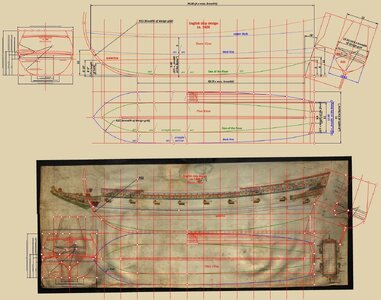
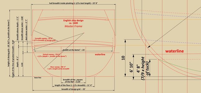
Persuaded by Taras, who is closely observing and, as it were, keeping an eye on this project, I made an even more thorough inventory of the analysed plan before the next planned stages. Particularly convincing are the newly found round ratios of the various design dimensions of this vessel. In particular, the following dependencies should be noted:

Max. breadth = 22’ 8”
Breadth of design grid = 22'
„Bredth at the beme” = 21'

– length of the keel = 3 x max. breadth = 68’
– length of the deck = 4 x max. breadth = 90.67’ (90.80’ on the diagram)

– height of design grid = 6/7 x „bredth at the beme” = 18’
– height of the max. breadth = waterline level + 3’ = 9.50’ (seemingly pretty standard distance at the time)
– depth in hold = 2/5 x „bredth at the beme” = 8.40’
– length of the floor = 1/2 x max. breadth = 11’ 4”
– height of gripe = 7/9 x height of tuck = 4’ 8”
– sweep of the stempost = breadth of design grid = R22’
– sweep of the upper narrowing line = breadth of design grid = R22’
– breadth of the stern at the deck line level = 3/5 x „bredth at the beme” = 12.60’
– max. breadth of the stern = 3/5 x breadth of design grid = 13.20'

Somewhat unexpectedly, the underside of the deck beams was taken by the designer as a reference level while designing/drawing the ship plan.

It has also to be said that the wales, being structural elements of essentially negligible conceptual importance, have been drawn quite haphazardly on the master frame projection (or rather on the sheer view) by the designer and, as a consequence, their position on both these projections is not the same (for this reason, the wales have been omitted from the presented graphic for the time being).

In this post, I have included some graphical extracts taken from this more comprehensive inventory, however, due to the already quite high "density" of the whole drawing, below also a PDF attachment featuring high-resolution graphics.
ViewCapture20231216_194626.jpg


ViewCapture20231216_194950.jpg

.​
 

Attachments

  • English ship design ca. 1600 – reconstruction lines.pdf
    21.9 MB · Views: 39
Last edited:
'​
Of special note is the inconsistency of the position of the wales and in general the height of the upperworks on the master frame projection and the sheer view. A possible explanation for this anomaly is the following scenario.

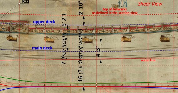
In Newton's manuscript, a general rule is articulated that the height of the hull above the waterline in the midship should not be higher than the draft of the ship. And indeed, on the sheer view drawn as first, the hull at this point has a height of 16 feet, which is exactly double the ship's draft of water.

However, in this case the designer ran into a problem. The thing is that the design assumed a rather small draft for a seagoing vessel of these dimensions. On the other hand, reducing the unobstructed height of the main deck (here about 6' 2" or even round 6') and the already quite small distance of the gun ports from the surface of water (here about 4' 3") was not an option. What's more, the height of the bulwarks above the upper deck also had to be taken into account. In this state of affairs, it is therefore not surprising that the designer, while drawing the master frame projection in the last instance, was forced to make his design more realistic by increasing the height of the above-water hull by 2 feet 10 inches (and, accordingly, rearranging the position of the wales), contrary to the recommendations expressed in Newton's manuscript, and in effect making the ship somewhat more leewardly.

The dimensions in question are shown graphically In the diagram below.


ViewCapture20231217_231111.jpg

.​
 
Last edited:
.​
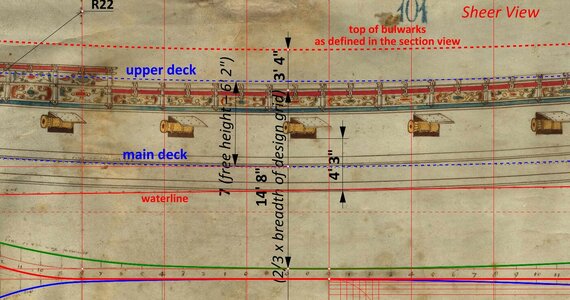
To elaborate a little further on the explanation given above, a slightly different variant is also possible, but for exactly the same reasons, i.e. the need to keep the silhouette of the ship sufficiently low to maintain its correct sailing properties.

When drawing the sheer view in the first instance, the designer initially assumed a round value of 2/3 for the height-to-width ratio of the design grid. Later, while drawing the master frame projection, this overly optimistic value proved insufficient for the reasons given in the above post and had to be adjusted accordingly, by increasing the height of the design grid (hence the top of bulwarks) by 3 feet 4 inches.

This is also shown in the diagram below.


ViewCapture20231218_111046.jpg

.​
 
Last edited:
.​
The analysed plan of the ca. 1600 ship has another quite peculiar feature. Namely, despite misleading appearances, the stempost-keel-sternpost assembly was not drawn on the sheer view at all. Rather, what at first glance appears to be the contours of this assembly can be regarded as a representation of the thickness of the frame timbers, and the lowest horizontal line defines the deadrise, which is here 10 inches.

In geometrical terms, any other interpretation of this drawing is simply not possible without completely ruining the intricate, precise coherence of the entire conceptual construction of this design.

A more complete sheer view, already supplemented by the stempost-keel-sternpost assembly, should more or less look like the diagram below.


ViewCapture20231219_122020.jpg

.​
 
Last edited:
.​
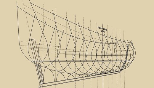
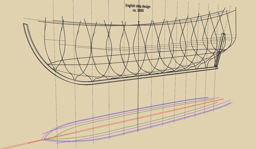
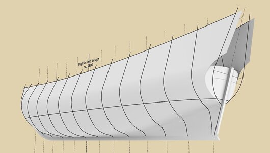
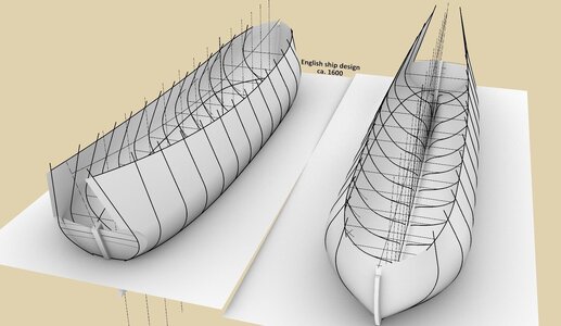
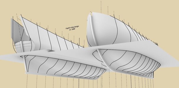
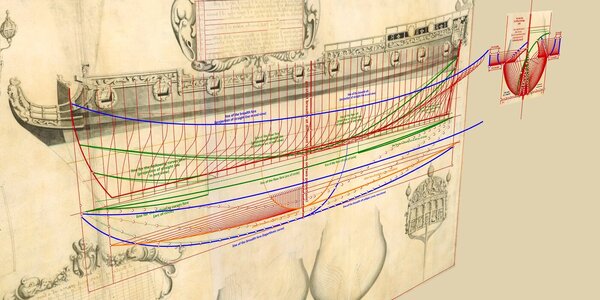
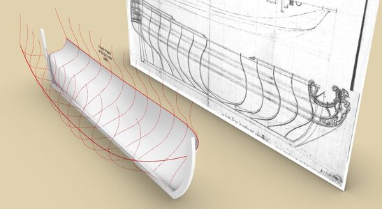
In a recent, state-of-the-art monograph article from this year, the subject of which is this very plan, published in the renowned periodical The Mariner's Mirror, there is a statement that the individual projections were not drawn to an equal scale (consequently, no attempt was even made to offer an explanation of the concept used to design the ship). In spite of this devastating diagnosis, supported by the names of the most recognised authorities in the field, the lines on this plan, exactly as they were drawn on it, nevertheless allowed me to obtain perfect shapes of the hull surface, at the same time completely in accordance with all the projections on this plan. It was simply enough to effectively recognise and apply the correct design method (in this case Mediterranean), and the result of the hull shape reconstruction carried out can be seen in the diagrams below.

It should also be said that the very process of the reconstruction of the hull shapes on the basis of this plan, allowed me to discover some design subtleties, about which the incomplete written sources are silent, let alone modern studies, which have been generally characterised for a long time by a disappointing stagnation in what is probably the most important aspect of shipbuilding.


ViewCapture20231224_003811.jpg


ViewCapture20231223_234957.jpg


ViewCapture20231224_004016.jpg


ViewCapture20231224_004626.jpg


ViewCapture20231224_004942.jpg

.​
 
Last edited:
The hull is very beautiful.

Although it appears to me that the rides too high (purely visually I would place the waterline somewhere between the wales, about 1-1 1/2 feet higher) but it kind of depends on the load probably.

And what kind of stern tuck is presumed after all, round or square?
 
.​

Although it appears to me that the rides too high

Ah, yes :). The graphic shown above is a kind of shape study with the height of the bulwarks brought uniformly to the top guide line. In the final version, the hull surfaces should of course be cut down to the correct (smaller especially at midship) height. Similarly, the beakhead area should be created by trimming. After such a trimming procedure, the hull should already look much more realistic in this respect.

A general rule of thumb for this period is: midship height equal to draft, stern height equal to 2 x draft, height at the bow equal to 1 1/3 x draft. However, if the draught is low, precisely as in this project, it may not be possible to keep within these limits. In particular, it is a question of maintaining the proper distance of the gun ports from the water surface, as well as the distance between decks, which on warships should not be less than the height of the men.


And what kind of stern tuck is presumed after all, round or square?

This is an interesting and so far unclear issue. Iconography for this period strongly suggests square tuck sterns still. Such as, for example, this portrait of Phineas Pett. However, technically, it is indeed possible to shape the stern of this ship with a round tuck as well. Alas, such an alternative interpretation would not have any iconographic support even for a couple of more decades to come.


Phineas_Pett_from_NPG.jpg


Pett_Phineas_Portrait_copy (002).jpg

.​
 
Last edited:
This is an interesting and so far unclear issue. Iconography for this period strongly suggests square tuck sterns still. Such as, for example, this portrait of Phineas Pett. However, technically, it is indeed possible to shape the stern of this ship with a round tuck as well.

On the one hand the plan is apparently done after the order to build ships with round tucks, if I am not mistaken, on the other it wasn't unusual for such a small and yacht-like ship to have a square tuck in any case for two centuries ahead.

I was curious, though, if there are any hints to the stern structure that can be deduced from the plan, or they are completely interchangeable architecturally?
 
The graphic shown above is a kind of shape study with the height of the bulwarks brought uniformly to the top guide line.

It was very silly of me not to notice, but I looked at the original plan and the waterline there also appears somewhat lower than it should.
 
.​
I was curious, though, if there are any hints to the stern structure that can be deduced from the plan, or they are completely interchangeable architecturally?

Yes, there are hints clearly suggesting just round tuck sterns on early plans and in manuscripts, however I plan to carry out an analysis of these other plans and materials in separate threads. On this very plan there are no such clear clues; on the contrary – the full/round shape of the stern contours indicates a square tuck stern (although it does not completely rule out a round tuck stern).


On the one hand the plan is apparently done after the order to build ships with round tucks, if I am not mistaken


:) Now you have an absolute duty to provide details of this order from around 1600 or earlier. If you succeed, I promise I will also make a round tuck stern graphic variant for this ship. :)


and the waterline there also appears somewhat lower than it should.


The actual draught of a ship already built is of course a very fluid parameter, and in that sense you are right that in reality the ship may have sailed deeper than designed. It can be seen in the way that initially some specific draught values had to be adopted in order to carry out the design in a rational way, even if later it was not or could not even be adhered to.

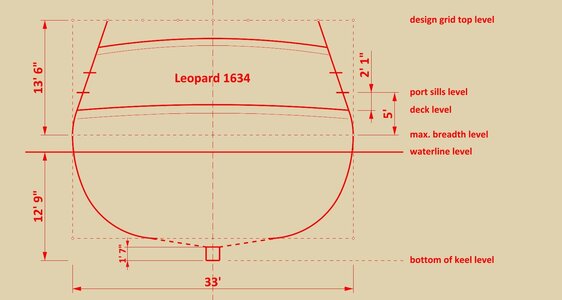
For comparison, one can also look at the design from the post #12 as well as the schematic diagram below of the master frame of Leopard 1634, which I have made on the basis of its known dimensions. Unfortunately, the distance of the greatest breadth level from the waterline cannot be deduced from these surviving dimensions, and in this case it was taken from the almost contemporaneous Sovereign of the Seas 1637, i.e. two feet. It is of note that Leopard 1634 is a proportionally shallow draft vessel (by design), as is the ship from the ca. 1600 plan.


ViewCapture20231226_210934.jpg

.​
 
Last edited:
Now you have an absolute duty to provide details of this order from around 1600 or earlier.

That's not an easy one.

I can't find anything concrete out of hand, and all I can remember at the moment there was some talk about a Navy Board order or decision circa 1610-1612 concerning employment of the round tuck on all future ships. If I shall run across any details or confirmation of this I'll surely post it here :)
 
.​
If I shall run across any details or confirmation of this I'll surely post it here :)


Thanks :). Without settling this rather slippery question of square or round tuck sterns now, one can only add that a more certain dating of the Newton/Scott manuscripts, as well as the interesting anonymous plans of the English origin kept in the Hermitage collection in St Petersburg, would have helped a lot here.

But a word more about the ship's draught in relation to the greatest breadth of the hull. For hydrostatic reasons (resistance to capsizing) it is extremely important that the draught level is always somewhat below the maximum breadth (tumblehomed ships era!). Even then, designers were perfectly aware of this relationship (although they were not yet able to calculate it properly, relying rather on design experience), and today it is categorically required by the regulations.

.​
 
Last edited:
.​
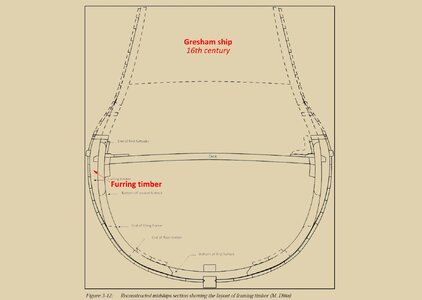
... and this is why the greatest thickness of the eventual furring or girdling applied to the transversely unstable hulls was actually located not at the waterline level (or below), but somewhat higher. As can be seen in the attached graphic reconstruction of the Gresham ship wreck cross-section, from this very period (drawing by Massimiliano Ditta from the study The Gresham Ship Project. A 16th-Century Merchantman Wrecked in the Princes Channel, Thames Estuary, 2014).

In other words, the purpose of furring or girdling was not to increase the buoyancy of the hull or even its simple widening per se, but to change its geometry to a more hydrostatically favourable one by increasing the breadth of the hull just above the surface of water in relation to its breadth at the draught level (in a smooth manner, of course).

Thank you for your participation and attention,
Waldemar Gurgul


Pages from Auer Jens, Maarleveld Thijs J. - The Gresham Ship Project. A 16th-Century Merchantm...jpg

.​
 
Last edited:
.​
Thank you very much Maarten. I had originally still intended to show exactly how the hull shape shown above was reconstructed from this plan, including the quite tricky hollowing (bottom) curves, but such an interpretation, while it might be interesting in itself for some, is not already as important as proving that in the first decades of the 17th century English shipwrights were still using Mediterranean methods and in their original form.

From private correspondence I also know that Taras Pevny is now analysing another important document by an English shipwright from this very period, quite scrupulously concealed today and virtually unknown even to interested researchers (it is not the Baker manuscript), possibly because it also clearly exposes the anachronistic narrative strenuously pushed in the so-called 'official' modern publications.

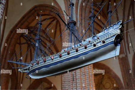
As a kind of important curiosity, I am also attaching a photo of an exact copy of the Stockholm galleon from around 1600. Typically for a votive model, the underwater part of the hull may not have the right proportions, but the sharp gripe seems to be, on the other hand, very realistic.


Stockholm galleon ca. 1600 - #2.jpg

.​
 
Last edited:
.​
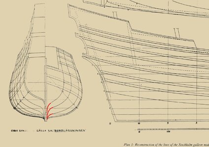
Hi Bela. Descriptively, it's the part of the hull at the junction of the stem and keel that has a sharp shape. See also the attached section of the plan of the Stockholm galleon reproduced from Peter Kirsch's valuable work – The Galleon. The Great Ships of the Armada Era (with red lines added in this area).


ViewCapture20240122_193703.jpg

.​
 
.​
Hi Bela. Descriptively, it's the part of the hull at the junction of the stem and keel that has a sharp shape. See also the attached section of the plan of the Stockholm galleon reproduced from Peter Kirsch's valuable work – The Galleon. The Great Ships of the Armada Era (with red lines added in this area).


View attachment 423125

.​
It is actually suprising to see this disappears during the 17th century and returns in French ship design in the early 18th century.
Have you found any reason for this?
 
.​
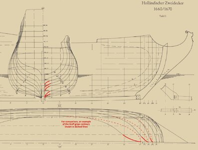
Let me elaborate a bit on this. In the Dutch context, it seems warships also typically had a sharp gripe, as can be seen on the plan of the famous Hohenzollern model 1670, with the section lines of the gripe marked in red. Even Vasa 1628, built using the bottom-first method, has a sharp gripe, although somewhat less accentuated.


Hohenzollern model 1660-1670 - gripe.jpg


The sharp gripe may have been beneficial for improving the ship's weatherliness, speed and ease of riding at anchor, thus improving overall sailing properties, but it came at a cost. For very long hulls (say, sporting length to breadth ratios well over 4:1) and a large stempost rake, an overly sharp gripe could already be seen as more harmful than useful.

In general, the hulls' entry could have been even sharper, encompassing the entire forward underwater part of the hull, and not just the gripe area, as can be seen on the below sample graphics, but this came at the very high price of not supporting the ships' components weighing down the bow (foremast, bowsprit, whole beakhead assembly, anchor bits, anchors themselves, often the heaviest guns on the ship, etc.) and reduced the ships' overall carrying capacity, heavy pitching, susceptibility to hogging and an even greater risk of unsuccessful turns. It's a matter of design choice and aptly balance of desired properties.

The functions of the sharp gripe achieved by appropriately shaping the hull could also be at least partially realised by the stempost of a large width in this spot.


English design 1684:

ViewCapture20230625_184317.jpg


French design 1686:

ViewCapture20230719_182339.jpg

.​
 
Last edited:
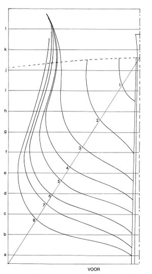
Beautiful work and very clarifying, actually something I never focussed on. You can even see it on the contemporary model of a typical retourschip as the Prins Willem. Below the fwd lines of the contemporary museum model as taken by Herman Ketting.
Prins willem FWD hull shape.png
 
Back
Top